Wednesday, July 10, 2013

Destination Bunting, Banners and postcard update


This is an update for Destination bunting, banners and postcard.

The poster was created by Kat and touched up abit by Ms Queenie


here's the poster design.


Here's the banner design


Bunting Design


I've narrow down the elements in banners and bunting from the poster to keep it simple


As for the poscard, I keep (almost) the same as the poster that Kat did, just that some elements/detailing are gone. 

*because I've been doing the bunting and banners, so im really tired to deal with the postcard so here're the slightly undone version.


Sunday, July 7, 2013

Bumble berry Website update 2


I spend 2 days vectoring and arranging in dreamweaver. There goes my weekend.


Saturday, July 6, 2013

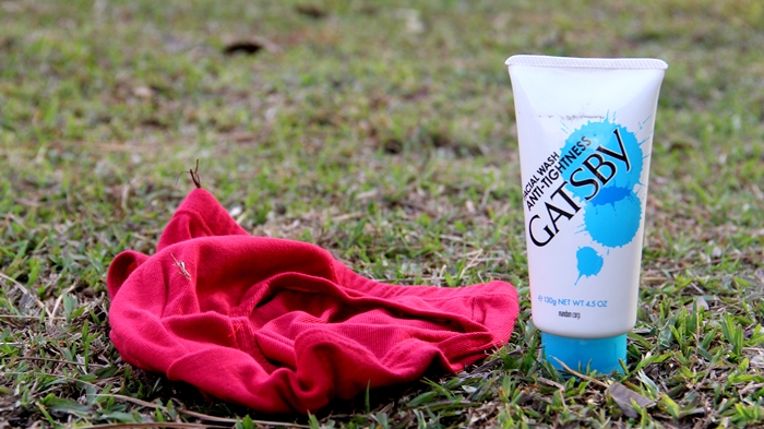
Gatsby Group Video, Super Tight with Kelvince


On Friday and Saturday me and kel were discussing about gatsby idea.
Slowly we execute the idea to Superman and we start sketching out story boards, looking for cast and getting props ready.

On the day before we only start shooting, I guess we just like to live dangerously, or maybe we over confident but well, it still turns out great. I quite like it.

You can read kelvince post her, *HERE

some photo behind the scene.


we print out the superman signature logo


sexy time, 


our superman <3 <3 <3 , awesome mun who's so kind to help us!


Gold Fish


Final Shoot


This ideo shooting took only 2 hours plus, which so many scene I think we supaa awesome la can work in some production company liao.

Special thanks to


Kel 


Khaiz


Our superman , MUN!


and William !! who's faking clark kent.

I truly thanks those who came to help us.

*****

After dinner we edited the video and here's the outcome. Please Enjoy


ok the end


nothing to do here BYE!

Thursday, July 4, 2013

HANDS Video


Our production decided to improve the video for "Hands" where we make a better color correction.
Here's the finalize of the video


Please enjoy :)
I would say all of us put 1000% of effort to make this done and I'm satisfy with the outcome

Tuesday, July 2, 2013

bumble berry website

After finishing the "hands" video, I decided to focus on my Bumble Berry website.
I've re-design it for 100x times and finally I decided stick to one which Im satisfy.

Brace yourself, Its Pink and blue overload

Home page,


spend most of my time designing the Icons / buttons to fit my logo


Most of the buttons are functional now.
Portfolio Page have been brush up except for design and photography page. Others are all done.


Lastly, the Contact Page


What's left to do is the About Me page.